Indoor Queue Systems and User Experience: Enhancing Design for Better Navigation
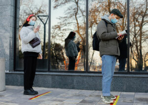
Indoor queue systems are critical components that ensure people can move safely and efficiently in crowded spaces. In large indoor environments like shopping malls, hospitals, airports, and office buildings, a well-designed queue system not only helps individuals find their way to the right locations but also makes their interactions with the space more efficient and comfortable. However, the effectiveness of a queue system is directly linked to not only its functionality but also its user experience (UX).
At Tekno Grup, we focus on improving user experience in indoor queue systems to create more effective and user-friendly solutions. When designing queue systems, several key elements must be considered, such as map readability, icon clarity, color selection, and overall functionality. In this article, we will dive into some important tips for improving user experience in indoor queue systems.
Queue Layout: Delivering Information Accurately and Quickly
One of the most fundamental components of an indoor queue system is the layout. The layout provides a visual guide to help users understand where to wait and how to progress through the line. However, queue layout design is a critical step for delivering accurate and quick information. Complex, hard-to-follow, or overly detailed queue layouts can hinder users from making effective use of the system.
The most important factor to consider in queue design is simplicity. It’s essential to avoid unnecessary details that might distract users from the essential information. Additionally, key details such as line flow, waiting area signs, and entry/exit points should be clearly visible and easy to understand. When users look at the layout for the first time, they should be able to immediately understand where to wait and how to proceed. Therefore, the design should be simple, intuitive, and easy to follow.
Another critical aspect is readability. Text on the layout should be large enough, legible, and have a high contrast with the background. Different colors can be used to highlight specific areas or sections of the queue, but care should be taken not to overuse colors, as this may cause confusion.
Signage Clarity: Universal Communication
In indoor queue systems, signage is a powerful tool that breaks down language barriers and provides universally understandable information. However, for signage to be effective, it must be simple, widely accepted, and easy to understand by all users. Complex or culturally specific symbols may prevent users from effectively navigating the queue system.
At Tekno Grup, we ensure that the signage used in our queue systems consists of simple and widely recognized symbols. For example, signs indicating the start of the queue, waiting areas, or service points should be instantly recognizable and understandable to all users. These signs should be designed using universal symbols and standardized so they can be easily understood by people from different cultural backgrounds.
The size of the signs is also very important. Signs that are too small may not be noticeable, while excessively large signs can disrupt the visual balance of the queue system. Therefore, signs should be appropriately sized, clear, and easy to understand.
Color Selection: Visual Hierarchy and Emotional Impact
Colors in queue systems not only enhance visual appeal but also serve as important tools for guiding users. Different colors can indicate specific areas to wait, signal caution, or direct individuals to the correct queue lines. However, improper color selection can make it difficult for users to effectively navigate the system.
When selecting colors for indoor queue systems, several key factors must be considered. First and foremost, color contrast is crucial. Sufficient contrast between the colors used for signs, floor markings, and text will improve readability. For example, light-colored text and signs on a dark background reduce eye strain and make it easier for users to access information.
The psychological impact of colors is also important. For example, green often represents “go” or “safe,” while red typically indicates “stop” or “caution.” As such, the psychological effect of colors should be taken into account when designing the system to ensure that users are properly guided based on these emotional cues.
A simple yet effective approach to color selection is essential. Each element of the queue system should be clear and easy to distinguish, enabling users to quickly access the information they need.
Functionality and User-Friendly Design
The success of a queue system depends not only on the visual elements but also on its functionality. The primary goal of a queue system is to help users wait in an orderly fashion, proceed through the line efficiently, and reach their destination quickly. Therefore, the system’s functionality should be considered at every stage of design.
A good queue system should anticipate users’ needs and be designed accordingly. For instance, in a shopping mall, the queue system should account for peak times and ensure there are enough stations or counters to avoid long waiting periods. Similarly, in airports and hospitals, queue systems must help manage large crowds and ensure smooth transitions for individuals, particularly in time-sensitive situations.
Queue systems should not only fulfill their function of organizing people but also be user-friendly and accessible. Special signage for people with disabilities, clear pathways, and touch-free entry systems are essential for a fully inclusive queue experience.
Effective UX Design in Indoor Queue Systems
In indoor queue systems, user experience should be carefully addressed throughout the design process. Elements such as layout, signage clarity, color selection, and functionality are crucial to making queue systems not only efficient but also improve the interaction between users and the environment. Queue systems should help visitors wait in an orderly manner, avoid confusion, and create a smoother experience overall.
At Tekno Grup, we offer optimized, user-friendly, and aesthetically pleasing queue solutions for every type of indoor environment. Our systems make it easier and safer for people to navigate through crowded spaces, enhancing the overall user experience.
By prioritizing user experience, we ensure that each space is equipped with the tools needed for smooth, efficient, and intuitive queue management, allowing everyone to move through it comfortably and without confusion. Whether it’s for large shopping malls, hospitals, airports, or office buildings, our queue systems are designed to meet the unique needs of each space and the people who use it.
Contact us to get more details.